Services
+ Identity Design
+ Content Strategy
+ Print Design
+ Art Direction
+ Promotional Assets
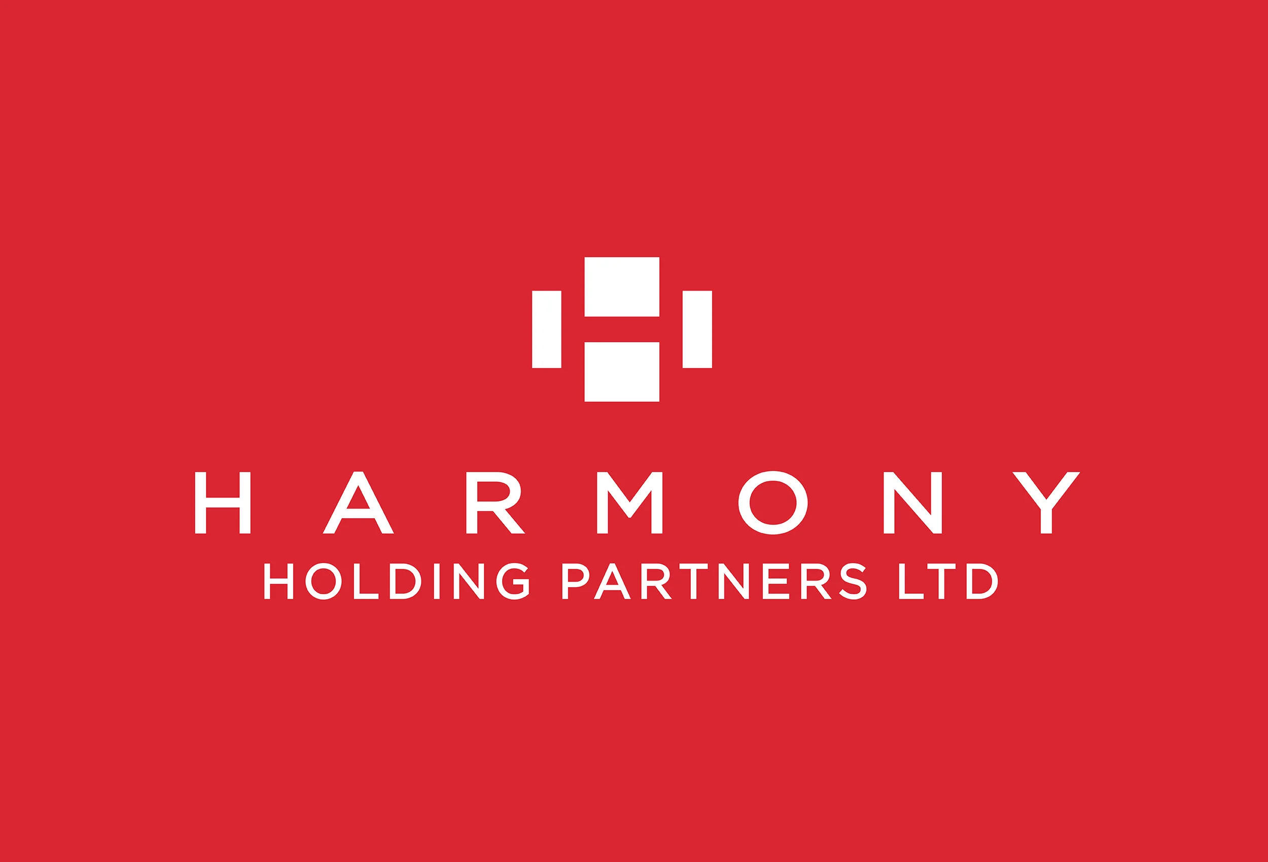
Harmony Holding Partners Ltd
How does a newly formed investment management company, with a focus on untapped Chinese opportunities, create an international brand identity to pursue long-term partnerships? FGI was asked to tackle that question. Working closely with the leadership of Harmony Holdings Partners, FGI created a brand identity inspired by HHP’s culture, requirements and name. The new and streamlined “H” monogram is a simple, sophisticated, modern and welcoming visual representation of Harmony’s DNA and Chinese origin. It also spotlights the company’s vibrant culture, mix of businesses, bold spirt and Chinese / U.S. business connection.
The logo was scaled to work across various platforms – from large format signage to smaller digital applications, as well as animation and print communications. The monogram is also the foundation of a systemized brand architecture that locks up the “H” visual with the company’s various businesses – thus creating a series of sub-brand, color-coded identity symbols that link back to the parent company, Harmony Holdings Partners.